Jitter plots (or strip plots) are a method for better visualizing the distribution of a set of data. When plotting a large number of data points, overlapping marks can often be a problem. By introducing a small amount of random noise into the data, a jitter plot slightly disperses the data points to make the overall distribution easier to analyze.
Google Data Studio can easily display a scatterplot, but there isn’t a built-in way to add random noise into a data set. At the moment, Data Studio doesn’t have a “RANDOM” function available for use in calculated fields. However, that just means you have to generate the randomness in your dataset before connecting to Data Studio.
If your data is in a spreadsheet, the “RAND” function in Google Sheets is all you need to power your jitter plot. Simply add a column with =RAND() to generate a random number between 0 and 1.
Once you have a “random” factor as a metric in Data Studio, you can add it to your x-axis metric in order to create the desired effect.
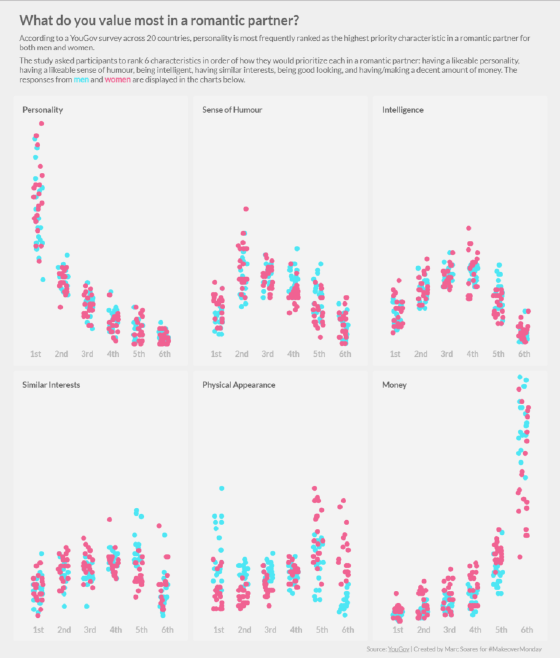
Here’s an example created for Makeover Monday. It shows the results of a survey that asked men and women across 20 countries about their preferences in a romantic partner. By jittering the points, it is easier to see clusters in the data that would otherwise be obscured by overlapping points.