Tile maps. A favourite among data viz practitioners and enthusiasts for visualizing geographic data. By representing each region at an equal size, a tile map eliminates the visual bias created by differences in physical area.
Maps of the United States are particularly prone to this bias. On a traditional map, Texas and California are much more visually prominent than, say, Delaware or Rhode Island. If the data presented is unrelated to physical area, this bias makes it difficult to fairly compare states and see patterns.
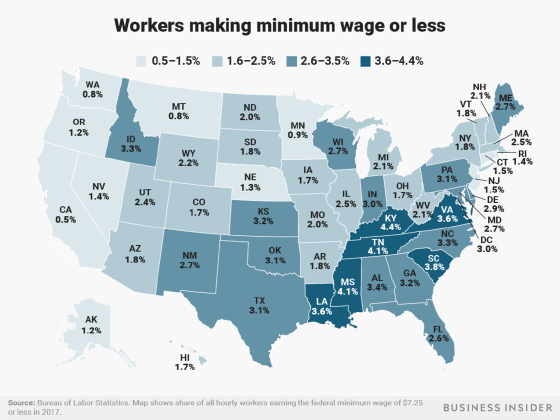
A traditional map makes it difficult to fairly compare states and see patterns.
A tile map, however, comes with its own challenges. Turning states into equal-area tiles means that compromises must be made when arranging them on a map. The spatial relationships between states cannot always be preserved. With the exception of the Four Corners, state borders are anything but straight lines and 90 degree angles.
There are many variations of a square tile map of the United States. Here are several that I have come across:
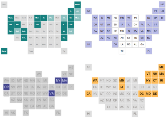
Sources: NPR (top L), Bloomberg (top R), FiveThirtyEight (bottom L), New York Times (bottom R)
When I was creating my first U.S. tile map viz about a year ago, I searched for the perfect tile layout. However, each one I found had something about it I didn’t like: North Carolina beside South Carolina; North Dakota beside South Dakota; odd placement of Wisconsin, California, or D.C.
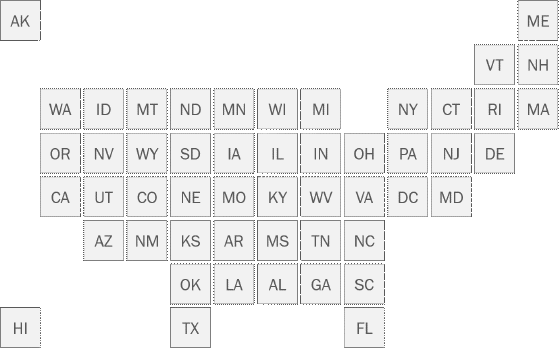
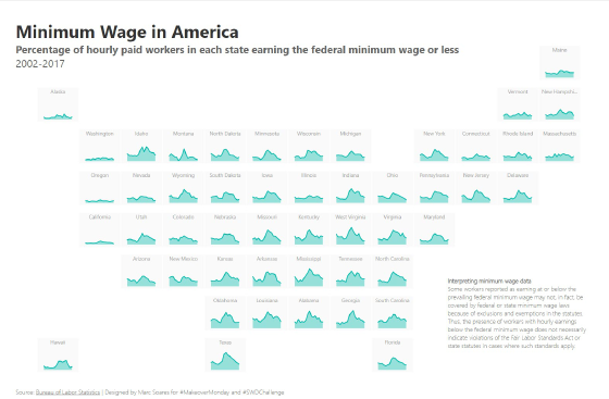
Ultimately, I decided to create my own layout to better respect the geographic relationships of the states, in particular:
- Washington-Oregon-California along the west coast
- Washington-Idaho-Montana-North Dakota-Minnesota along the 49th parallel
- Space between Michigan and New York
- Washington D.C. adjacent to Maryland and Virginia
- West Virginia west of Virginia
- North Carolina above South Carolina
- North Dakota above South Dakota
- Texas and Florida extending south
- Alaska at top left, Hawaii at bottom left
My final tile map looks like this:
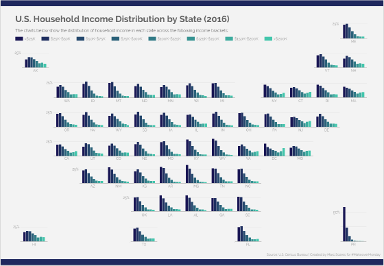
I have used this layout in two different visualizations so far:
Let me know if you decide to use this layout in your own work. I would love to see your vizzes!