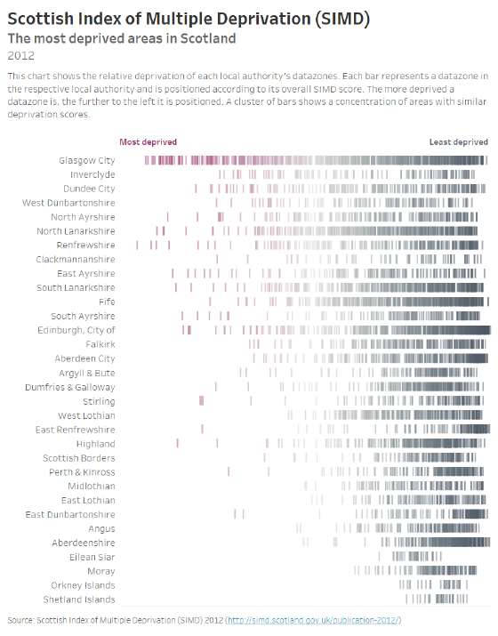
This week’s #MakeoverMonday dataset presented a lot of options for visualization. The data is from the Scottish Index of Multiple Deprivation (SIMD), a national report that scores and ranks the relative “deprivation”, or poverty level, across Scotland. The population is divided into “datazones”, which are each associated with a local authority. Each datazone is evaluated on seven different aspects: employment, income, health, education, crime, housing, and geographic access to services. These scores are then combined into an overall deprivation index. The objective of the SIMD is to identify the areas in Scotland suffering from deprivation in multiple aspects.
In the 2012 SIMD report, the following “barcode chart” is used to present the level of deprivation in each local authority:
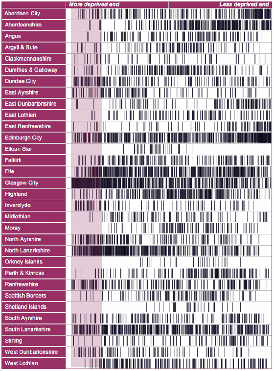
What works well?
- Using the bars allows a lot of information to be encoded into a compact graphic
- Dense clusters of bars make it easy to spot regions of concentrated deprivation
What could be improved?
- The local authorities are sorted alphabetically. It may be better to sort by level of deprivation.
- The datazones are plotted by ranking (1 to 6,505), but this does not allow for comparison based on deprivation score. Most likely, the level of deprivation is not linear along the ranking.
Here is my version, improving upon the original barcode chart. After playing around with circle marks, boxplots, and other forms of viz, I decided to keep it simple and make incremental improvements:
- Local authorities are sorted by Local Share of Deprivation. Those at the top have a higher percentage of their datazones among the 15% most deprived in Scotland.
- Bars are plotted according to the overall SIMD score, not the ranking. This makes the relative levels of deprivation more apparent.