In her recent article for Forbes, Eva Murray writes about How to use simple visual designs to communicate data. She describes how simplicity in design helps make data visualization clearer and easier to understand. One of the examples she showcases is my The World’s Top Exporters of Medicine viz from Makeover Monday Week 8, 2018.
Inspired by Eva’s post and my viz, Charlie Hutcheson wrote a #TakeapartTuesday post detailing his process of replicating my viz in Tableau. I feel honoured to have my work featured by Eva and Charlie, and I recommend that you go read both of their posts:
- How to use simple visual designs to communicate data by Eva Murray
- #TakeapartTuesday using placeholders by Charlie Hutcheson
I created this viz almost a year ago with the intention of showcasing the features of Google Data Studio, specifically the ease of adding year-over-year calculations to a table and bar chart. In this post, I’ll show you exactly how to achieve this without any complicated workarounds.

Let’s go step-by-step through creating this chart in Google Data Studio.
1. Create a new data source
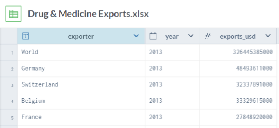
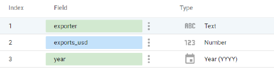
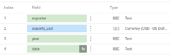
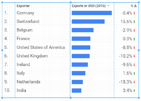
We begin with the data on drug and medicine exports by country (from Makeover Monday 2018 Week 8). This dataset contains 3 columns: exporter (country), year, and exports in USD.
To create the data source in Data Studio, we can either upload the data as a Google Sheet or connect directly to data.world. The resulting schema in Data Studio should look like this:
2. Create a new report
We now add our data source to a new report.
In the report editor, we should first set the canvas size in the Layout panel. My viz uses a width of 600px and height of 500px.
3. Add a new chart
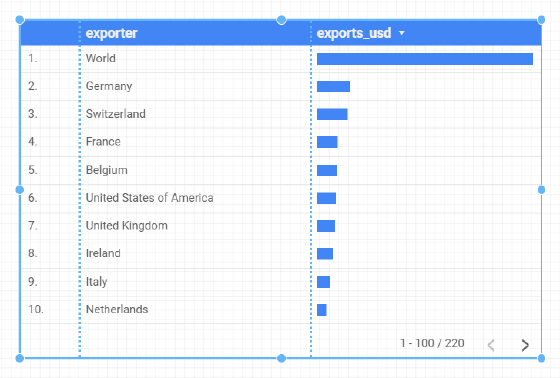
Next, we can add a table with bars. This is a default option in the chart presets menu.
Before we worry about formatting, let’s get the data to display in the way we want.
4. Filter and transform the data
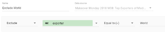
At this point, we see the aggregate exports for all years, as well as the “World” summary row. So, we need to add a filter to our chart to exclude World:
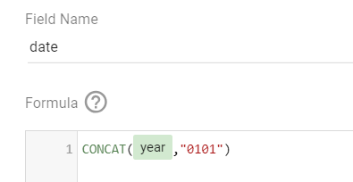
To filter for 2016 only and show the year-over-year change, we will use Data Studio’s built-in date functionality. However, we first need a full date field. Although we have the year available, Data Studio’s date range filters and comparison metrics rely on a full date (i.e. YYYYMMDD).
We need to add a new calculated field in our data source that appends “0101” to the year:
To ensure everything works properly, we need to format both year and date as “Text”. You may think we should use a date format, but trust me, it needs to be text. While we’re here, we should also format the exports metric as currency (USD).
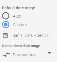
Now we can return to our chart. In the Data panel, first set the date field as the Date Range Dimension. Next, set a custom date range for the chart as Jan 1, 2016 to Dec 31, 2016. Lastly, select “Previous year” as the comparison date range.
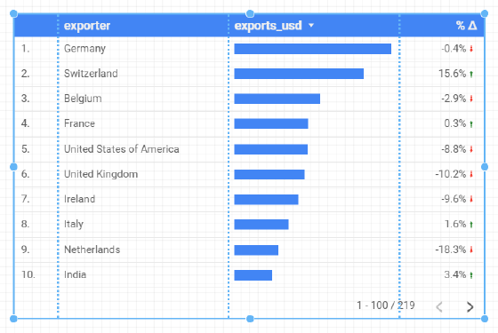
These date settings will automatically produce a % change column in our table:
Just like that, all the hard work is done! Everything else is layout and formatting.
5. Apply formatting and style
Let’s start by renaming the column headers to “Exporter” and “Exports in USD (2016)”. This can be done by editing the fields in the chart via the Data panel. We also need to change the “Rows per page” setting to 10.
Moving to the Style panel, let’s give the table header a transparent background, increase the font size of the table labels, make the cell borders transparent, and hide the pagination in the table footer.
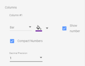
Almost there! In the style settings for the exports column, we need to enable “Show number” to display the metric value. We can then select “Compact Numbers” and set decimal precision to 1. We can also change the bar colour using the fill selector.
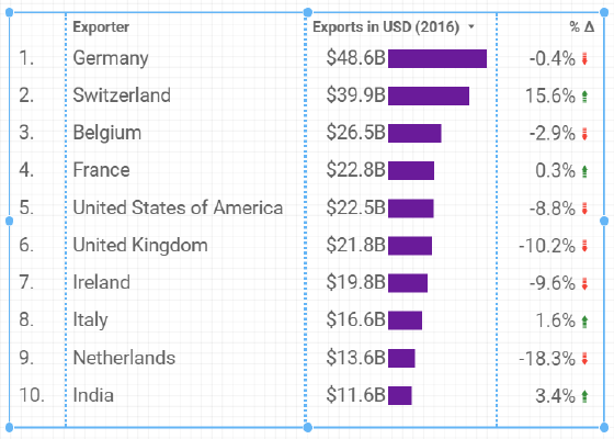
Our table now looks like this:
Finally, we can add some overall report formatting. We need to insert text boxes for the chart title and footer. The grey stripes at the top and bottom of the viz can be inserted using rectangles. The report font can also be set in the Layout panel; I used “Quicksand” in my original viz.

We’re done!
Although some of my Data Studio work involves what I consider to be “hacks”, the process above requires only standard data source and report functionality. I hope you will try it out yourself and share your thoughts.
If you would like to see a similar step-by-step breakdown of any of my other Data Studio vizzes, let me know which ones!