I recently participated in my first Data for a Cause challenge. In case you haven’t heard of it before, Data for a Cause is an initiative that connects data visualization professionals with non-profit organizations to help bring attention to social and environmental issues.
Each challenge is focused on a specific theme—such as global hunger, public education, or environmental conservation—in collaboration with a particular non-profit organization. Participants are provided with a dataset and a defined objective and tasked with creating a visualization.
For this 9th Data for a Cause Challenge, we were asked to visualize data on international marine conservation for the United Nations Environment World Conservation Monitoring Centre.
I’m happy to say that my viz below earned a 3rd place mention! Read the full results here.
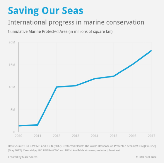
Comment from UNEP-WCMC team: Marc Soares' image is very elegant, it has a very clear message.