This post recounts my experience building my first ever Iron Viz feeder contest submission. View my complete viz on Tableau public: INVISIBLE WALLS: The Reality of Racial Segregation in America.
View all the Iron Viz Geospatial submissions on the Tableau Public blog.
Finding a story to tell
The first order of business was to decide on a topic for my viz and to find the appropriate data and shapefiles. I started exploring open city data, inspired by Tableau product manager Kent Marten’s examples in his recent post on the Tableau blog.
After trying out a few shapefiles of New York City population, I thought it could be interesting to compare population and density across the largest cities in North America: Mexico City, New York, Los Angeles, Toronto, Chicago. But I soon realized that obtaining comparable data from each city was going to be problematic; the available data was not necessarily in the same format, at the same level of granularity, or even in the same language. Mexico City didn’t appear to have an easily accessible public data library. And the Statistics Canada website just happened to be down at the same time as this feeder contest was announced.
So, for about a week I bounced ideas around while searching for other sources of data and shapefiles. I knew I needed a good story, but for many of the shapefiles I found, I couldn’t create an interesting story, and for some story ideas I thought could be interesting, I couldn’t find relevant shapefiles.
With about a week left to the contest deadline, I returned to my initial ideas about cities and population. I downloaded a shapefile from the U.S. Census Bureau that contained population data for every census tract in the country. I was able to import this mass of data into Tableau without issue, however it slowed the program to a crawl. There were just too many rows to map and explore all at once. However, this led me to choosing my ultimate Iron Viz story.
This census dataset contained racial and ethnic population breakdowns for each census tract. Seeing this data triggered a memory of a fascinating visualization I had seen a few years back—The Racial Dot Map by Dustin Cable. In this interactive map, every person is the United States is represented as a dot coloured according to their race or ethnicity. The intriguing result of this viz is the ability to see how different races are often clustered into ethnic neighourhoods within the same city.
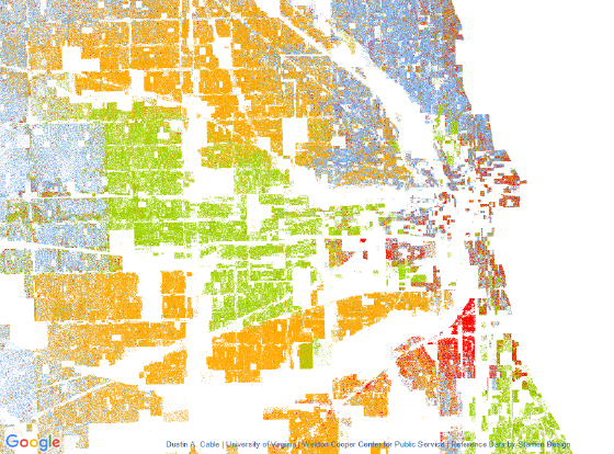
Chicago, as shown in Dustin Cable’s Racial Dot Map
Dustin Cable’s Racial Dot Map was inspired by the work of Eric Fischer, Brandon Martin-Anderson, and Bill Rankin before him. So, in the same spirit, I took this as inspiration for my Iron Viz submission—I decided to tell a story about racial segregation in the cities of America.
Compiling the data
As I discovered from my first try working with U.S. Census data, it would not be feasible to use a single data source. But if I was going to focus on a few major cities, I didn’t need data for the entire country anyway. Thus, I found my way to the U.S. Census Bureau’s TIGER/Line Shapefiles and American FactFinder.
For the shapefiles, I downloaded the county file of census blocks for each of the cities in my viz. In the case of a city spanning multiple counties, I downloaded the state file instead. In Tableau 10.2, it’s not possible to combine (or “union”) multiple shapefiles into a single data source, so it was necessary to have a single shapefile for each city.
The data comes from the 2010 Census Summary File 1, Table P5, which contains data on race and ethnicity (which for the purposes of the census are two distinct characteristics). It took a few tries to figure out how to use the American FactFinder tool, but once I got the hang of it, compiling a dataset for each city was relatively straightforward.
In Tableau, a simple join on the census block ID gave me a data source for each city.
I created a few calculated measures to give me the percent of the total for each racial/ethnic category (i.e. White, Black, Hispanic, Asian, Other), and another calculated field to return the majority:
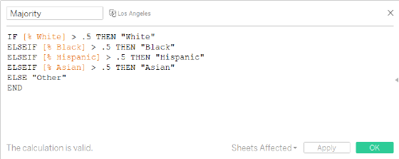
For each map in Tableau, I dropped Majority on the Color shelf to colour each census block according to its majority population.
With the data all sorted out, I proceeded to refine the design, analysis, and storytelling of my viz.
Building the framework
I played around with a few different formats for my viz: should I use a single column? a grid? maybe an actual Tableau story? As an Iron Viz submission, I wanted it to be visually impactful, and so I thought it should fill the screen. I wanted it to have the feel of an infographic or poster. And with geospatial being the central theme, I wanted the maps to be front-and-centre, not an accessory to a bunch of other charts and tables. A grid layout seemed to be the most natural choice, so the question then was how many cities would be enough?
Though I started with only New York, Los Angeles, Chicago, and Houston (the 4 largest cities in the U.S. by population), I realized that in order to achieve the impact and scale that I envisioned for this viz, I would need to cover a lot more cities. So, I started doing research on racial segregation in the U.S. and came across several different articles and studies about the most segregated cities in the country. As a result, I started adding to my list: Philadelphia, Baltimore, Milwaukee, Atlanta, St. Louis. In the end, I had 13 cities visualized in my Tableau workbook. In order to create an even 4-by-3 grid, I had to drop one city (sorry Detroit).
Designing the details
Being my first ever Iron Viz submission, I didn’t want to leave anything to chance. Thus, I obsessed over every detail of my viz: font, colour, spacing, size. I even deliberated over whether I should use the American spellings of “color” and “neighborhood”. Here are just some of the most important design details:
- Colour: I used the same colours as Dustin Cable’s racial dot map, i.e. blue for White, green for Black, orange for Hispanic, and red for Asian. However, I chose lighter, more muted shades from Tableau’s “Summer” palette.
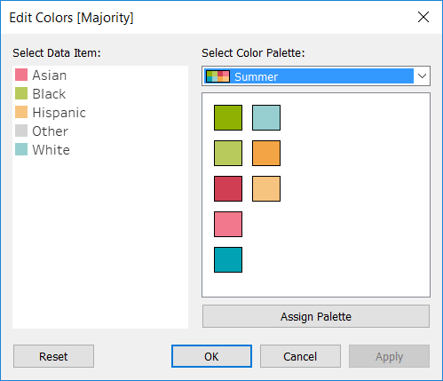
- Legend: The default Tableau colour legend was far too inflexible for the design I wanted. Instead, I created a custom legend using dashboard layout containers for the top and bottom of my viz.
 When I shared an initial draft with some of my colleagues, they raised a concern that readers may forget the colour association once they reached the middle of the viz and the legend was out of sight. To help alleviate this problem, I inserted a “mini-legend” between each row of maps to provide a constant reference.

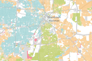
- Maps: In order to eliminate as much distraction as possible, I turned off all map layers so that only the data is visible. I love how the geography of the city is still discernible from coloured census blocks, even without a background. To me, this is just an example of maximizing the data-ink ratio, a la Edward Tufte.The only exception is Houston, for which I left the “streets and highways” layer enabled. This is because as I was researching the population patterns of Houston, I found that major highways running through the city have heavily shaped adjacent ethnic neighbourhoods. So, showing the roads makes this relationship more evident.
Telling the story
Once all the maps were done, the final step was weaving a coherent story throughout the viz. I decided to write an introduction at the top and a few comments below each city map. I researched each city using Wikipedia and other sources in order to understand the racial segregation patterns that were apparent in the viz. It was interesting to learn how certain cities have been shaped by historical policies, others by immigration, and others by geography and infrastructure. Ultimately, I hope every person who reads this viz will learn something new.
Building this viz over the past couple weeks has been an exciting, yet exhausting experience. It has required the application of my entire repertoire of data visualization knowledge and Tableau skills. My goal, of course, was to create a viz worthy of being selected as an Iron Viz finalist, and I can only hope that I have done so.
View my completed viz on Tableau public: INVISIBLE WALLS: The Reality of Racial Segregation in America.