The “barcode” chart has been used to great effect for visualizing the performance of sports teams over the course of a season. After seeing the work of Peter Gilks (BallCode) and Craig Wortman (MLB Bar Code Chart), I decided to take a run at creating my own barcode viz using the results of the most recent NHL season.
If barcodes can work for basketball and baseball, then why not hockey?
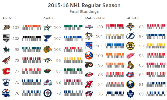
My interactive viz below represents the final standings of the 2015-16 NHL regular season.
The barcode chart shows the win-loss record of each team. I used custom shapes to add the team logos and a custom colour scheme for the barcodes.
I’m generally a proponent of using colour in a chart only when it serves a purpose. In this case, the logos and corresponding colours enable any hockey fan to easily find a team based on these visual cues alone.