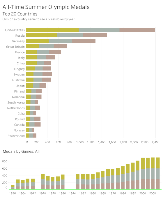
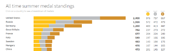
Prior to this past summer’s Olympic Games in Rio, I came across an interesting graphic from Reuters titled Precious Medals. It displays the all-time medal standings of the Summer Olympics, and allows you to drill into each country to view its performance over time.
I was impressed with the simplicity, yet sophistication of this presentation. The clean bar charts and appropriate use of colour keep the viz uncluttered. Yet, the interactivity allows a lot of information to be embedded within the graphic.
Naturally, I decided I would try to replicate this visualization myself with Tableau.
The result of my efforts is below: