Update: LinkedIn has deprecated the InMaps tool. Generating the relationship graph as described in this post is no longer possible.
In Part 1 of What Does Your Social Network Look Like?, I analyzed my Facebook graph using Wolfram|Alpha.
Most often when we speak of “networking,” it is in a professional context. So what exactly does your professional network look like? How good of a “networker” are you really? In this post, I will take a look at my LinkedIn network through LinkedIn’s InMaps feature.
InMaps makes it very easy to create a visualization of your LinkedIn network. Simply authorize the app to access your profile and it will set to work generating a graph of your professional network. It may take a couple minutes to run, possibly longer if you have a very large number of contacts. You should get something like this:
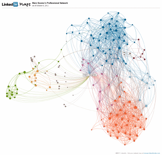
Upon first glance, the graph may look slightly confusing—like an entangled mess of wires. However, InMaps provides some help in interpreting your network. Contacts are automatically grouped into colour-coded clusters. These will likely correspond with significant places or events in your professional life, for example your alma mater, your current workplace, or a conference your attended.
Unfortunately, the layout algorithm that InMaps uses isn’t the best, as it produces many confusing overlaps. Also, the graph would look much cleaner if I could exclude myself from my own network, thus eliminating a lot of unnecessary lines.
Similar to the Facebook graph produced by Wolfram|Alpha, InMaps only shows 1st level connections. This is understandable since a set of several hundred can balloon to several million when 2nd and 3rd level connections are included.