Update: Facebook has deprecated the API that enabled the Personal Analytics for Facebook tool in Wolfram Alpha. Generating the relationship graph as described in this post is no longer possible.
Ever wondered what your social network looks like? In our increasingly “connected” society, it is interesting to see what exactly we are connected to.
The Personal Analytics for Facebook tool in Wolfram|Alpha analyzes your Facebook data and produces personalized insights and statistics. What time of day do you use Facebook the most? Which words do you use most frequently in status updates? How many likes do you get per post on average? These are just some of the questions you can answer.
Wolfram|Alpha also generates insightful information about your friends. Who comments the most on your posts? What percentage of your friends are in a relationship? How many of your friends are named David?
I find many of the insights really interesting, but my favourite is the friendship graph. This graph represents your network of friends as a collection of points connected by lines. Each point (or vertex) represents one of your friends, and a line (or edge) connects any two that are friends with each other. The size of each vertex indicates the number of mutual friends that you have in common with that person. As an example, here’s my Facebook friendship graph.
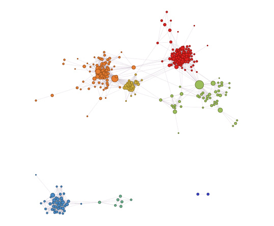
One of the first things you may notice is that there are several clusters of points. Wolfram|Alpha makes these clusters easier to identify by assigning each a different colour. It also provides additional information about the friends in each grouping. For example, the red cluster is mostly my high school classmates, while the orange is made up of friends from university. The yellow cluster is fellow Shad Valley alumni and the green points are an eclectic mix of other friends and family.
You should also notice that the graph appears to have two separate parts. The red, orange, yellow, and green clusters are all connected to each other. The bluish points however, are completely isolated. The blue cluster in the bottom left is comprised of people I met while on exchange in Denmark, mostly other exchange students. The aqua group were my floormates in residence in Denmark. Finally, the two darker blue points all by themselves are people I met at the church I attended in Aarhus.
It makes sense that there aren’t any mutual relationships between my network of friends in Canada and the network I built in Denmark. In fact, it further emphasizes how removed I was from everything I had previously known.
Note that I have chosen to exclude myself from this graph. If I were included, there would be one large vertex connected to every other vertex. The graph is easier to analyze without this clutter.
When you view your friendship graph in Wolfram|Alpha, you can mouseover each of the points to see who it represents. It can be interesting to see which of your friends are the “most connected” within your network, or alternatively which are the “outliers.”
Now, it should be noted that this graph only displays direct relationships. It is possible that two of your friends are indirectly connected through a sequence of two or more other people. However, this information isn’t available from just your own Facebook data. I would be really interested to see a graph of, say, my LinkedIn network, where 2nd and 3rd level connections are also displayed.
I encourage you to generate your own Facebook Analytics report. Just type “facebook report” into Wolfram|Alpha. There is so much more great information available than what I’ve mentioned in this blog post. So try it out and let me know what you discover! [Update: Facebook has deprecated the API that enabled the Personal Analytics for Facebook tool in Wolfram Alpha. Generating the relationship graph as described in this post is no longer possible.]