Here’s my first attempt at a Makeover Monday viz.
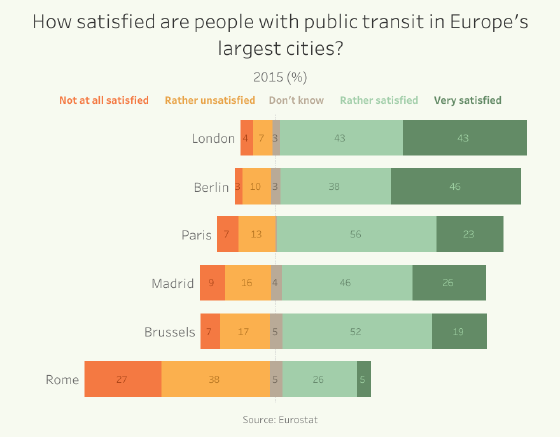
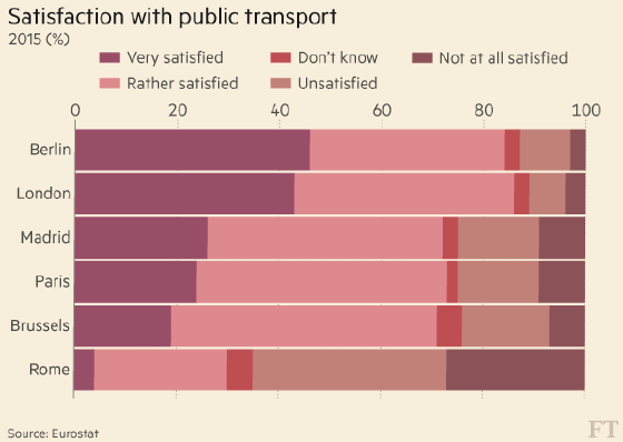
This week’s featured graphic is from the Financial Times. It displays the results of a public transit satisfaction survey conducted across Europe. Respondents were asked to rate their satisfaction with public transit in their city.
So how can we improve this viz? Let’s find out.
Here’s my version:
What improvements did I make?
- Taking a hint from Zen Master Andy Kriebel, I centred the bars around a central axis, showing positive sentiment to the right and negative to the left. This makes is easier to judge the overall response.
- I used an orange-green colour palette, with positive responses in green and negative responses in orange.
- Instead of a traditional colour legend, I used colour-coded text labels along the top of the chart. I also aligned the city labels immediately beside the data bars. And I added data labels on the bars, instead of using a horizonal axis. The intent of these changes is to make the chart easier to read by more directly labeling the data.