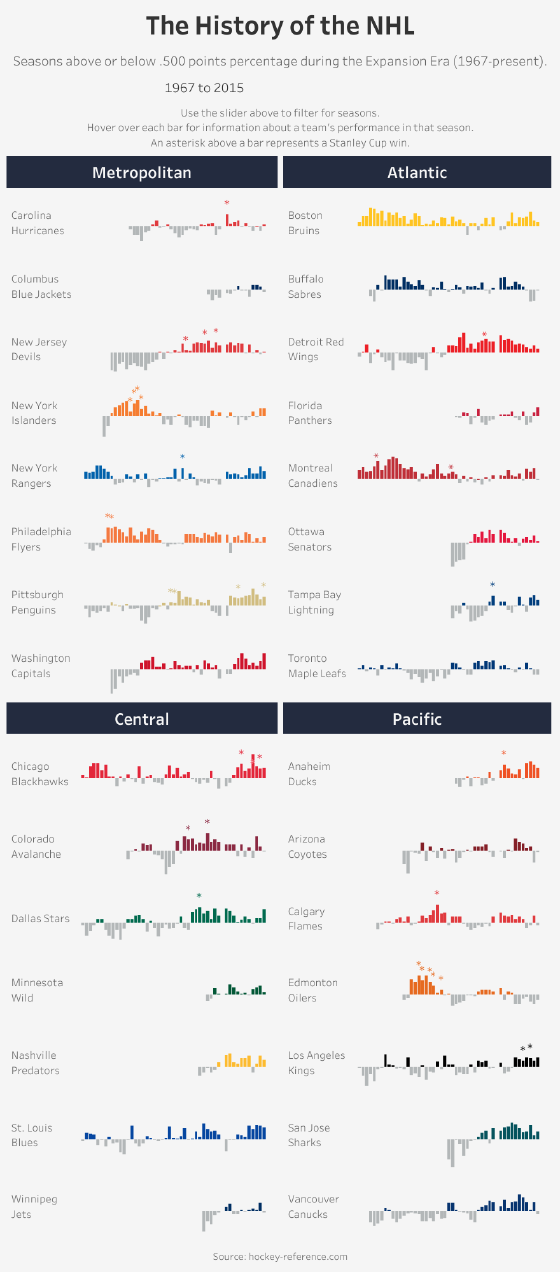
With the start of a new NHL season upon us, I thought I would visualize the historical performance of each NHL team. I used a format similar to my NHL Barcode Viz, except this time it’s not binary; rather, it charts Points Percentage above and below the .500 mark.
I took my inspiration from similar vizzes created by Chris Jones (MLB Franchise Performance) and Matt Chambers (The History of the NFL). I also took some pointers from Andy Kriebel in this blog post.
I have focused on seasons from 1967 to the present, i.e. the NHL’s “Expansion Era”, as only the Original Six teams were in existence prior to ‘67. The franchises are ordered alphabetically within their current divisions, and with their current team names. Winning seasons are shown in the team’s colour, while losing seasons are in grey.